Menu

Close

38

38

(2024)

Description

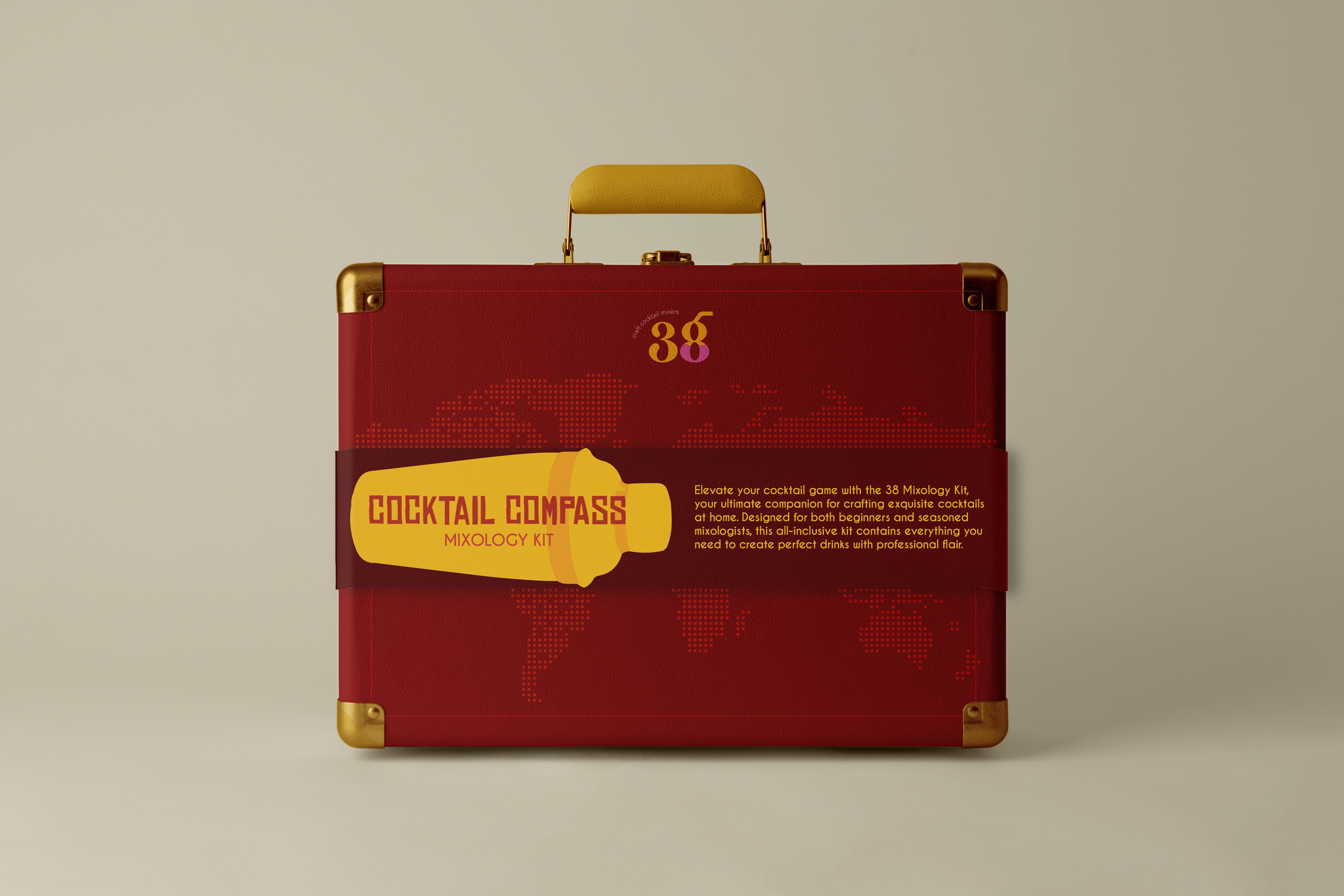
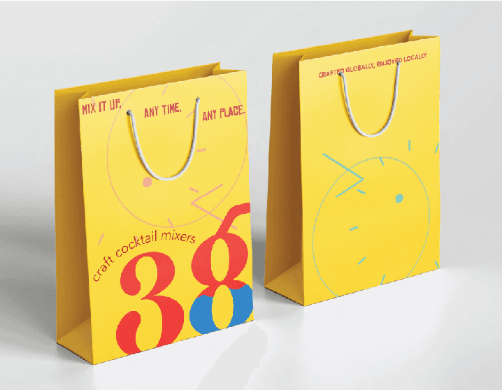
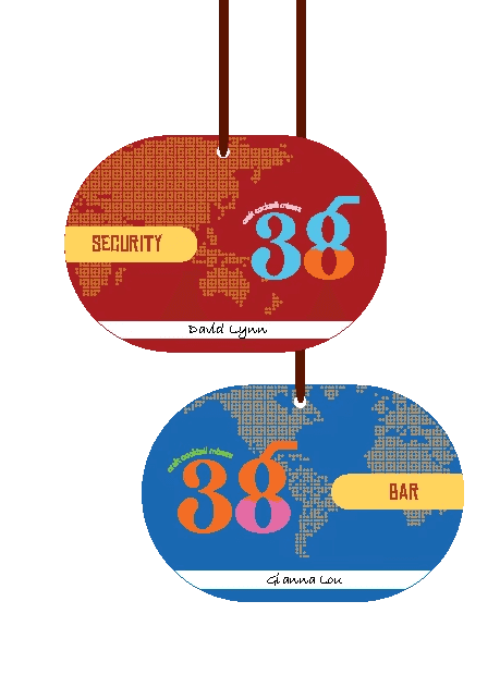
The brand is a pre-mix brand for cocktails (but can also be consumed as is) that makes blends based on flavours from around the globe. Based on the 38 timezones,the brand will have 38 different flavoured premixes each highlighting an ingredient popular in that area. These will be innovative new cocktail mixes that cater to all tastebuds,and the colorful and playful design choice will complement the vision of the brand. Using vibrant retro style illustrations and hand done lettering will allow this creative and playful idea to shine through. The store will also have an interactive station where customers can try these premixes with alcohol or even make their own blends based on their preferences.

TYPE

packaging and branding

Brand extensions

Brand extensions

The packaging and stationery design for 38 ties back to the brand’s global, time-inspired identity. The coasters feature a clean clock illustration with subtle timezone lines, while the tagline sits on the back for a simple, fun finish. The takeout carrier includes playful cocktail puns and a martini glass illustration that wraps around to the logo and tagline on the back. Bright, vibrant takeout bags reflect the brand’s energy, with a bold logo and deconstructed clock graphics that reinforce the time-based concept. Fun phrases on the front and the tagline on the back help keep the layout lively yet clean. Employee tags are shaped like globes, with dotted map illustrations and clear department labels, bringing the brand’s global theme full circle.

The packaging and stationery design for 38 ties back to the brand’s global, time-inspired identity. The coasters feature a clean clock illustration with subtle timezone lines, while the tagline sits on the back for a simple, fun finish. The takeout carrier includes playful cocktail puns and a martini glass illustration that wraps around to the logo and tagline on the back. Bright, vibrant takeout bags reflect the brand’s energy, with a bold logo and deconstructed clock graphics that reinforce the time-based concept. Fun phrases on the front and the tagline on the back help keep the layout lively yet clean. Employee tags are shaped like globes, with dotted map illustrations and clear department labels, bringing the brand’s global theme full circle.

The packaging and stationery design for 38 ties back to the brand’s global, time-inspired identity. The coasters feature a clean clock illustration with subtle timezone lines, while the tagline sits on the back for a simple, fun finish. The takeout carrier includes playful cocktail puns and a martini glass illustration that wraps around to the logo and tagline on the back. Bright, vibrant takeout bags reflect the brand’s energy, with a bold logo and deconstructed clock graphics that reinforce the time-based concept. Fun phrases on the front and the tagline on the back help keep the layout lively yet clean. Employee tags are shaped like globes, with dotted map illustrations and clear department labels, bringing the brand’s global theme full circle.

Environmental graphics

The wall menu displays all drinks with ingredient descriptions, color-coded glass icons, and tasting notes for easy browsing. Next to it, a world map mural matches drink colors to their origins, creating a playful, interactive experience. The poster promotes Happy Hour with a clock-shaped drink illustration and the phrase “Clock in for Happy Hour,” tying back to the brand’s time-based identity. A QR code leads to the website for more info.

The wall menu displays all drinks with ingredient descriptions, color-coded glass icons, and tasting notes for easy browsing. Next to it, a world map mural matches drink colors to their origins, creating a playful, interactive experience. The poster promotes Happy Hour with a clock-shaped drink illustration and the phrase “Clock in for Happy Hour,” tying back to the brand’s time-based identity. A QR code leads to the website for more info.